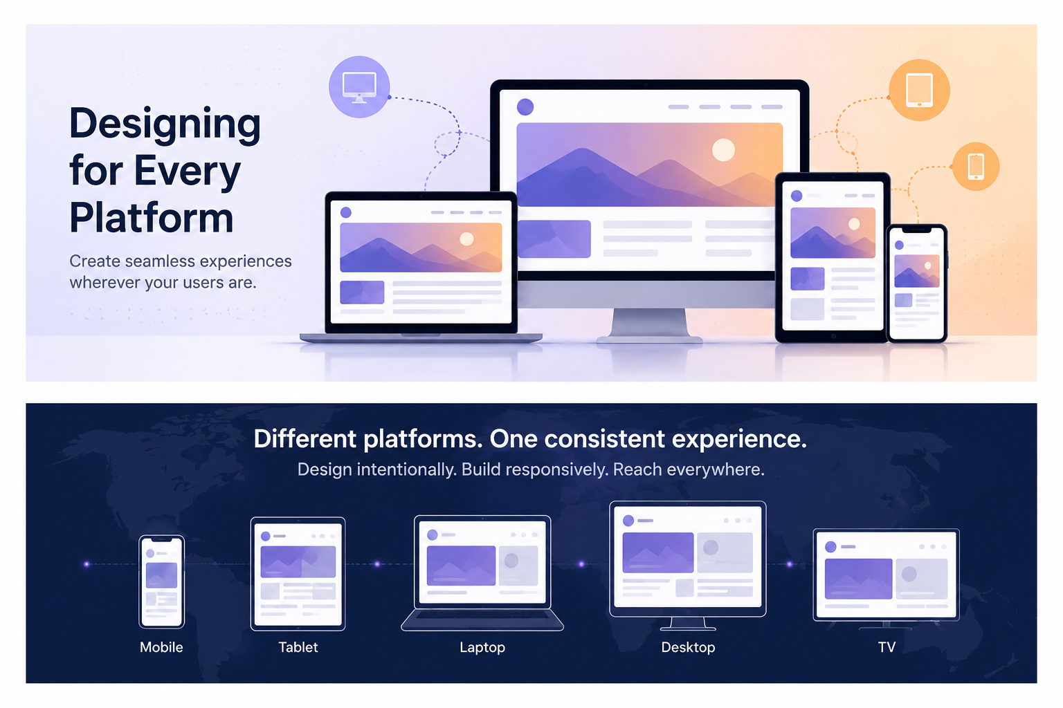
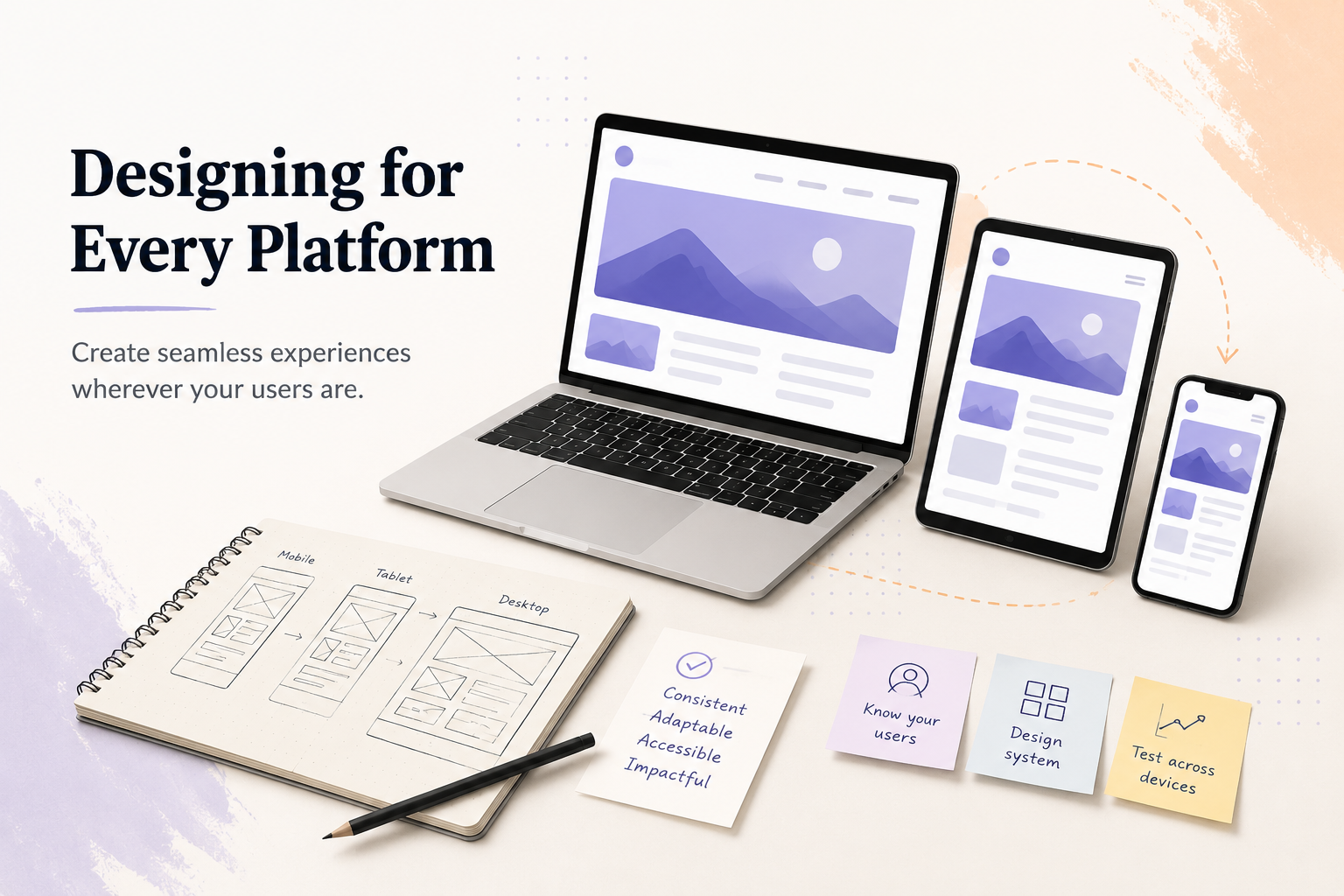
Every platform wants a different version of your creative. Instagram wants 4:5 portrait. LinkedIn wants 1.91:1 landscape. TikTok wants 9:16 vertical. YouTube wants 16:9. Pinterest wants 2:3. If you design separately for each, you're multiplying your production effort by five — and still probably getting something wrong. This guide is about a different approach: design once, intelligently, so that a single asset can be adapted to every format without losing what makes it work.
The Problem with Platform-First Thinking
The natural instinct is to start with the platform. "I'm making an Instagram post, so I'll design at 1080×1080." Then when you need the same asset for LinkedIn, you resize it and something gets cropped off. Then for TikTok Stories you pillarbox it. Then for Facebook you squeeze it. By the end, you have five mediocre versions instead of one great one. Platform-first thinking creates reactive, fragmented creative work. The better approach is platform-agnostic design: build a master asset with all formats in mind, then adapt rather than redesign.
The Four Aspect Ratios That Cover Everything
Across all major social platforms, nearly every image and video placement uses one of four aspect ratios. Understand these four shapes and you understand the entire landscape of social media formats.
| Ratio | Shape | Primary Platforms & Uses |
|---|---|---|
| 9:16 (0.56:1) | Tall vertical | TikTok feed, Instagram Reels/Stories, Snapchat, Facebook Stories — full-screen mobile content |
| 4:5 (0.8:1) | Portrait | Instagram feed, Facebook feed, LinkedIn feed — maximum vertical space without going full-screen |
| 1:1 (square) | Square | Instagram feed (classic), Facebook posts, Pinterest — universal safe format |
| 16:9 (1.78:1) | Landscape | YouTube thumbnails, LinkedIn articles, X/Twitter posts, Facebook video — wide-screen horizontal |
The Universal Canvas: Start at 1080×1920
Design your master asset at 1080×1920 pixels (9:16). This is the largest format any major platform requires, and every other ratio is a crop of it. Starting here gives you the most compositional freedom and ensures you never have to upscale. From a single 1080×1920 canvas, you can export: a 1080×1350 portrait (4:5), a 1080×1080 square (1:1), and a 1920×1080 landscape (16:9, by rotating and re-cropping). The 16:9 landscape is the only ratio that requires a different orientation — we'll address that separately.
Safe Zones: The Non-Negotiable Rule
A safe zone is the area of your canvas that remains visible regardless of how the platform crops or frames it. Every platform overlays UI on top of your content — platform logos, action buttons, captions, navigation bars. If your subject or key text lands outside the safe zone, it will be obscured or cropped on at least one platform. Design everything that matters inside the safe zone. Use the outer areas for background, atmosphere, and non-essential visual elements.
| Output Format | Canvas Size | Safe Zone (center area) | Avoid these edges |
|---|---|---|---|
| 9:16 Full vertical | 1080×1920 | 1080×1420 (center) | Top 250px, bottom 250px |
| 4:5 Portrait | 1080×1350 | 1040×1260 (center) | 20px all sides |
| 1:1 Square | 1080×1080 | 1040×1040 (center) | 20px all sides |
| 16:9 Landscape | 1920×1080 | 1800×960 (center) | 60px all sides |
The most critical safe zone is the 1:1 center of a 9:16 canvas. If everything that matters lives in a central 1080×1080 square (from 440px to 1520px vertically), your asset will survive being cropped to square format on any platform. Make this box visible in your design tool as a guide layer.
Composition Rules for Cross-Platform Design
Standard composition rules apply here, but with extra constraints. The guiding principle is center-weighted composition — keep your visual anchor and focal point in the center third of the frame, not the edges. Edge-heavy composition is the most common reason assets fail when cropped.
- Subject center — Keep your main subject (person, product, logo) within the central 60% of the frame width and height. Side-by-side compositions almost always break when cropped.
- Negative space above and below — In a 9:16 vertical, you naturally have more vertical breathing room. Use the areas outside the 1:1 safe zone for sky, background texture, or atmosphere that can be safely cut.
- Avoid split compositions — Two subjects side by side work in 16:9 landscape but look bad in 9:16 vertical. One strong central subject scales to every ratio. Two subjects side-by-side do not.
- Keep text away from rounded corners — Platforms display content in rounded rectangles on mobile. Text in the very corners can be clipped by the UI frame even if it's within the safe zone.
- Logo placement — Put your logo or watermark at the top center or bottom center, never a corner. Corners are the most likely to be cropped or obscured by UI overlays.
- Background breathing room — Use a background that can extend in any direction without looking unnatural. Solid colors, gradients, and blurred backgrounds are forgiving of crops. Busy scenes with hard edges at the frame border are not.
Typography That Survives Every Crop
Text is where most multi-platform designs fall apart. Type that reads fine at full size becomes illegible when the asset is viewed at thumbnail scale, and text near the edges gets clipped by safe-zone violations. A few rules eliminate the majority of problems.
- Minimum font size of 32px at 1080px width — this translates to roughly 16pt on a phone screen. Anything smaller becomes unreadable in a feed thumbnail.
- Keep all text within the 1:1 safe zone — even if you're designing a 9:16 asset primarily for Stories. Text in the very top or bottom of vertical content will be obscured by platform UI.
- High contrast always — a minimum contrast ratio of 4.5:1 against the background (WCAG AA standard). This also makes your text readable in both light and dark feed themes.
- Short copy wins — aim for 6 words or fewer as your primary headline. Long body copy is invisible in a feed. If you have more to say, say it in the caption, not on the creative.
- Single font family — multi-format assets that mix typefaces look inconsistent when thumbnailed. One font, two weights (regular + bold) handles 95% of cases cleanly.
- Avoid text at the exact vertical center of a 9:16 canvas — on many platforms, UI elements (follow buttons, share icons) appear at the exact center point. Offset key text slightly up or down.
Color and Contrast: Designing for Both Themes
Most platforms default to dark mode for a significant portion of their user base. Your creative appears over a dark background in the feed — but also sometimes over a white background (in previews, web embeds, or share cards). Design with enough contrast that it reads clearly in both contexts.
- Avoid true white (#FFFFFF) backgrounds — in a dark-mode feed, a pure white background creates jarring contrast that draws attention for the wrong reason. Off-white or light grey is less abrasive and still reads as 'light'.
- Avoid true black (#000000) or very dark near-black colors as the only background — they become invisible against dark feed backgrounds. Add a subtle border, inner shadow, or slight lift in color (use #1a1a1a or #0d0d0d minimum).
- sRGB color space — always export in sRGB. Facebook and Instagram reprocess images and convert color spaces. Designs in wide-gamut color spaces (Display P3, Adobe RGB) will look dull after platform compression.
- Brand color accessibility — if your brand color is a light pastel or a saturated yellow, it may not pass contrast requirements against a white background. Have a fallback combination ready.
- Test dark mode AND light mode — open your design on a phone screen in both display modes. The colors will look different, and text that passes contrast on white may fail on a dark background.
File Format and Export Strategy
Export format is the last decision most designers make, but it has a significant impact on quality and file size. Each platform recompresses uploads — your goal is to give the platform the best possible source to work with.
| Content Type | Recommended Format | Recommended Settings | Why |
|---|---|---|---|
| Graphics with text | PNG | 24-bit, sRGB | Lossless — text stays sharp after platform recompression |
| Photography | JPG | 85–95% quality, sRGB | Smaller file, minimal visible difference at high quality |
| Images with transparency | PNG | 24-bit with alpha | JPG doesn't support transparency |
| Animation / motion | MP4 (H.264) | High bitrate, AAC audio | Universal codec, accepted everywhere |
| Short looping content | MP4 or GIF | MP4 preferred (smaller) | GIF is large and limited to 256 colors; MP4 is superior |
| High-res exports | PNG or JPG 95% | Maximum quality | Platform will downsample — start at the highest quality you can |
A master canvas with visible safe zone guides lets you see exactly what survives each crop before you export
A Practical Layered File Structure
The biggest time-saver in multi-platform design is a well-organized master file. Structure your Figma, Photoshop, or Illustrator file in layers that map to the export workflow, not the visual hierarchy.
- Layer: Safe zone guides — locked, non-printing overlays showing the 1:1, 4:5, and 9:16 crop boundaries. These are your guardrails. Never export with them visible.
- Layer: Platform UI simulation — optional ghost overlays showing where TikTok buttons, Instagram action bars, and Facebook labels will appear. Helps you avoid placing key elements under UI.
- Layer: Text and headlines — all text elements in one group, so you can toggle them off when exporting background-only versions.
- Layer: Brand elements — logo, watermark, icon. Separate from text so you can scale or reposition independently per format.
- Layer: Subject / foreground — the main visual element. Keep it as a smart object or component so it can be repositioned for landscape crops.
- Layer: Background — a layer that extends beyond the canvas in all directions (use a larger artboard or clipping mask). This lets you shift the crop without revealing empty canvas.
When to Adapt vs When to Redesign
Not every asset can be universally adapted. Some designs are fundamentally single-format: a side-by-side product comparison works in 16:9 landscape but cannot be cropped to 9:16 without losing half the information. Know when adaptation is worth it and when it isn't.
- Adapt (safe to crop) — single-subject photography, product shots on clean backgrounds, typographic statements, abstract brand assets, color-blocked designs.
- Adapt with repositioning — two-subject compositions that can be reframed to show one subject per crop (common in campaign photography).
- Redesign required — infographics (information layout is inseparable from the shape), side-by-side comparisons, charts and data visualizations, any design where the full width or full height is semantically important.
- Redesign for text-heavy content — captions and body text on social posts should always be rewritten per platform, not just resized. What reads well in a 1:1 square caption is often too long for a Story headline and too short for a LinkedIn document slide.
The One-Canvas Export Checklist
Before you finalize any master asset, run through this checklist to confirm it will work across formats:
- Is the primary subject fully visible in the center 1080×1080 safe zone?
- Is all text larger than 32px and within the 1:1 safe zone?
- Does the text contrast ratio pass 4.5:1 against the background?
- Is the design legible at 30% scale (thumbnail size)?
- Can the background extend in all directions without creating an obvious edge?
- Is the logo/watermark at a top or bottom center position rather than a corner?
- Is the file exported in sRGB color space?
- For graphics with text: is the export format PNG, not JPEG?